 Australia site →
 Global tax-deductible giving →
If you visited our website, read one of our emails, or follow us on social media, you might have noticed that we recently rolled out our new brand visual identity. We wanted to share with our donors, partners, and broader network why we decided to change, and why now.
Why We Chose to Update Our Brand
We’ve existed for over 13 years, and our brand has served us well throughout. Our mission remains the same, and so does our focus on extreme poverty. What has evolved is how we go about achieving it.
The research behind identifying the most effective organizations has advanced, our understanding of extreme poverty as a multidimensional problem has deepened, the number of organizations delivering high impact solutions has grown, and the broader ecosystem has shifted alongside all of it. We aim to keep pace with these changes, and where we can, stay ahead of them.
Along the way, we ran into a set of practical, everyday challenges: how do we explain our work clearly to someone hearing about us for the first time? How do we visually signal it when we team up with another organization? How do we help a donor tell our health work apart from our education work, or our work in women’s economic empowerment, at a glance? And how does our brand actually look and feel on a phone screen, where most people encounter us now?
At first, we tried to solve these one at a time within our existing brand: adding a few extra colors, sketching a small library of new icons for our impact reports, simplifying our typography. But each fix solved one problem and created friction elsewhere, and eventually it became clear that we needed to design the answer from the ground up rather than patch it together.
That was the insight that led to a new visual identity, one grounded in our roots, that carries the optimism we bring to our work, and that adapts cleanly across the many places The Life You Can Save shows up, big and small.
The Story Behind the Symbol
From the many paths proposed by Orlando Ruiz, the Creative Director who led this project, we chose a new symbol that takes inspiration from the heart, the long standing icon of The Life You Can Save, and transforms it into something more organic, reminiscent of a young sprout. It symbolizes our growth as an organization, and the growth of the impact we build together with our donors and recommended nonprofits: the seed we plant, that grows to bear fruit.
The new logo also pays homage to the book Peter Singer wrote, which later led him and Charlie Bressler to co-found the organization: the red symbol is also symbolic of a book page turning. Lastly, we incorporated a yellow dot, which some see as a sun, and others see as a flower. Either way, our goal is to evoke optimism and light.

Palette and Type
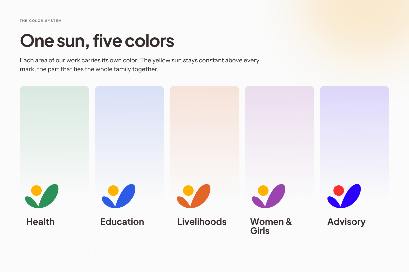
On the color palette, we wanted something that still felt like us, just brighter: an evolution, not a departure. Red remains our primary color, now in a more vibrant shade, paired with yellow for accent and brightness. We also expanded the palette so it applies to our symbol whenever we’re communicating about a specific sector within our approach to extreme poverty. This new system pairs colors with sectors and services, so you can quickly tell what you’re looking at.
Typography is where we aimed for consistency with our previous brand while staying in tune with the new symbol and colors. Our wordmark uses a sans serif font (Satoshi), which we pair with a serif font (Sentient) to create each of our sector logos.
There are many other details we worked through carefully. If you’re curious, our brand guidelines are available in full on our website, including a guide of dos and don’ts.
What This Means for You
You might be wondering how a new visual identity connects to our purpose. For us, the answer is simple, though it matters: it needs to support that purpose and represent it in a way that aligns with what we say and what we do. We didn’t set out to rebrand ourselves. We designed a new identity that catches up with how much we have evolved over the years, one flexible enough to support our future growth as we continue to expand our community and deepen our impact.
We invite you to see it for yourself, it’s live on our website and across our social channels now. Our newly published Education Sector Report is the first piece of research to carry the new identity in full.
I hope you like our new, refreshed brand identity as much as we’ve enjoyed creating it.